Skin
Describe the tone, then what the light is doing to it.
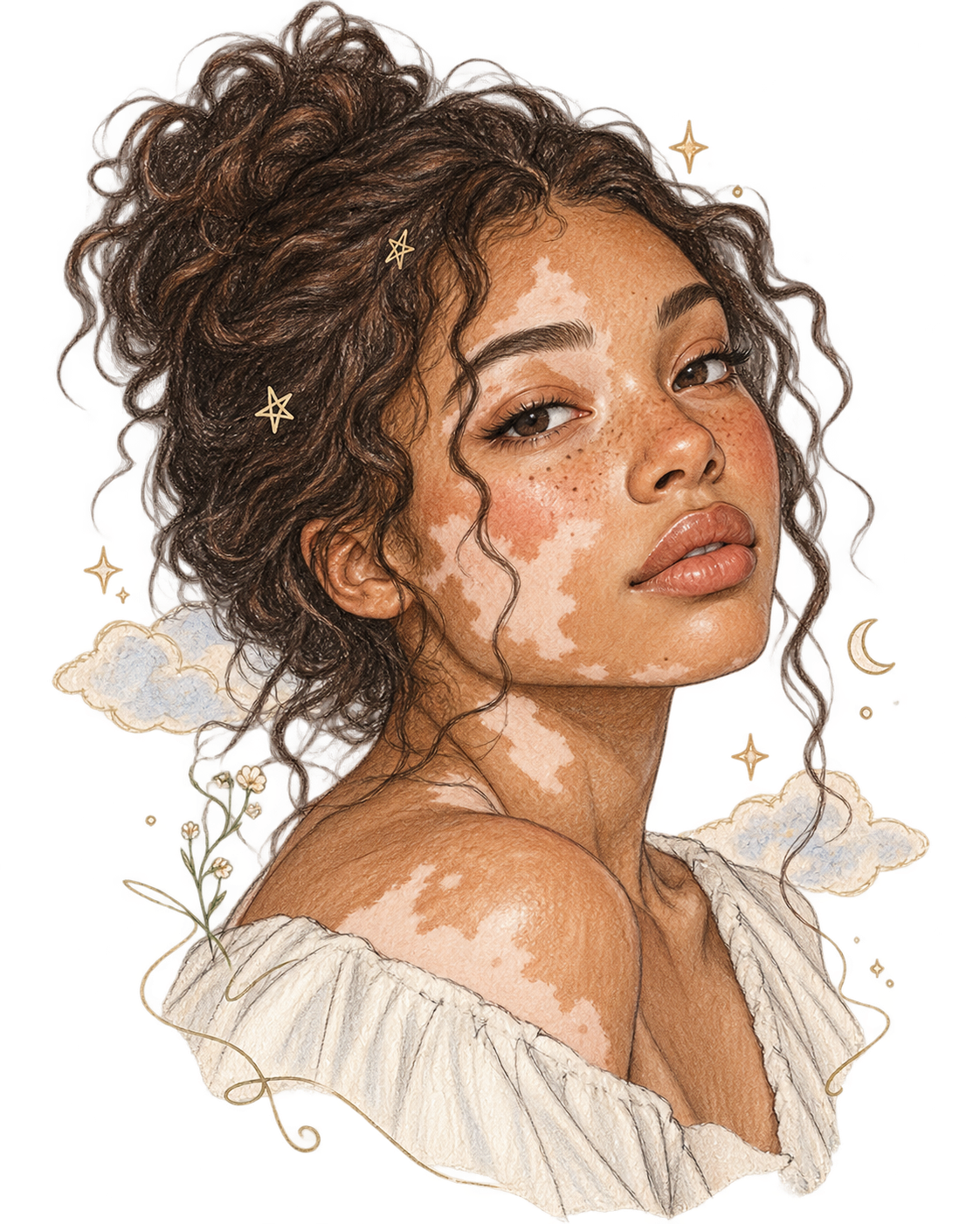
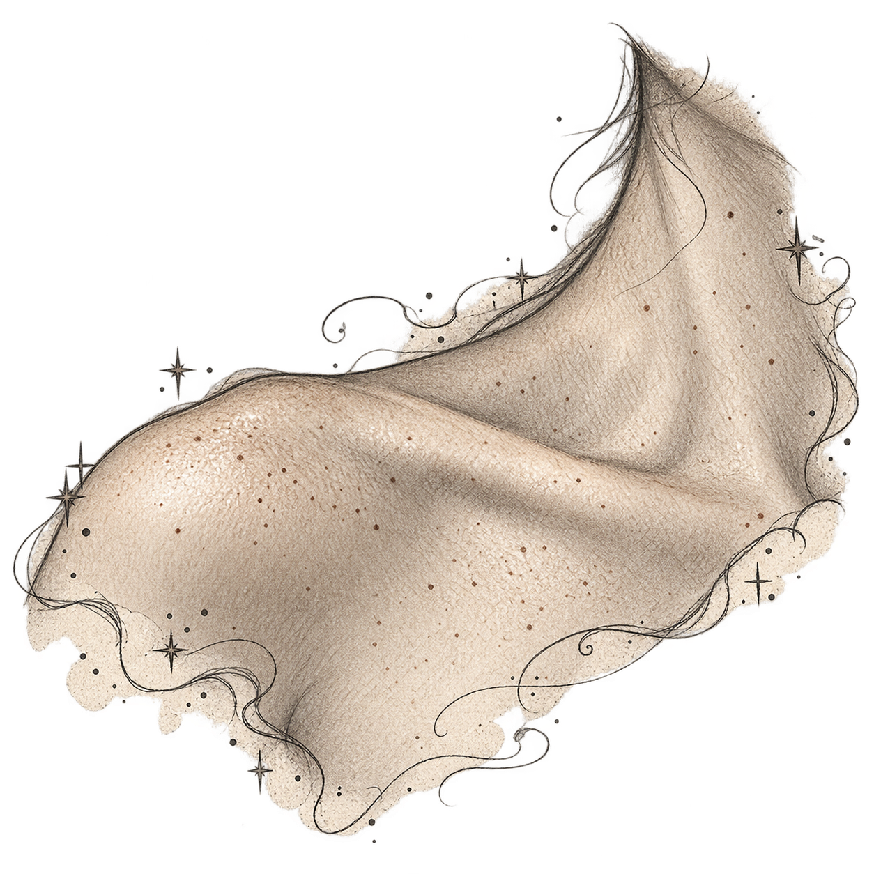
01Start with a plain color
Plain colors are always safe and never feel clichéd. If a character appears briefly, one of these is often all you need.
black · brown · beige · white · pink · olive · tan · fair · ivory · cream · golden · gray-brown
02Add depth or a modifier
Modifiers refine a color rather than replace it, so pair them with one from step 1.
- Light end
- fair, light, pale, porcelain-pale
- Middle
- medium, sun-warmed, honeyed
- Deep end
- deep, rich, dark (see note below)
- Temperature
- warm, cool, neutral
- Pairings
- pale pink, warm beige, medium olive, deep warm brown, rich dark brown
03Undertones
Skin is never one flat color. Undertones are the quieter hues beneath the surface, and naming one is the quickest way to make a description feel specific.
- Warm
- gold, peach, copper, amber, red-orange
- Cool
- rosy, pink, blue-tinged, ashen
- Neutral
- an even blend with no strong lean
- Olive
- a green-gold cast under tan or brown
04Light, flush & weather
This is where the page earns its tagline. Skin changes with light, emotion, health, and season.
- Catching the light
- glowed, took on a burnished sheen, gleamed at the cheekbones, turned amber in the lamplight
- Flushing
- color climbed the throat, cheeks bloomed, blotched at the neck, ears went red first
- Draining
- went ashen, waxy, sallow, gray around the mouth, drained of color
- Sun & wind
- sun-bronzed, freckled by July, windburned, peeling at the nose, tan lines at the wrists
- Season
- deepened over the summer, faded to a paler cast by February
- Setting
- moonlit, flickering in firelight, washed out under fluorescent bulbs, warm in morning sun
05Texture & detail
smooth · dewy · matte · freckled · weathered · sun-lined · scarred · fine-pored · downy · chapped knuckles · creased at the eyes · paper-thin at the temples · blotchy · clear · oily at the nose · dry at the elbows
06Comparisons: use thoughtfully
A comparison brings in everything the object suggests, not only its color. A cliff reads as rough and a beach reads as calm. Choose one that fits the character, the setting, and whose eyes are doing the describing.
- Metals
- copper, bronze, brass, burnished gold, pewter (these pair well with modifiers)
- Earth & clay
- terracotta, adobe, riverbank clay, sandstone
- Light & sky
- dawn, afterglow, harvest moon, dusk, a field at noon
- Gems & minerals
- topaz, amber, garnet, onyx, obsidian, smoky quartz (rarer words need a clue so the reader can see them)
- Wood
- walnut, mahogany, teak, birch (some readers dislike being compared to wood, so test it aloud)
- Plants & nature
- driftwood, acorn, wheat, birch bark
- Food
- avoid it for skin (see note below)
07Alternatives to “skin tone”
complexion · coloring · cast · tone · undertone · hue · shade · tint · sheen · glow · flush · blush · wash · pigmentation · palette · warmth
08Examples in a sentence
Plain + modifier
“She had warm brown skin and a gap-toothed grin.”
Undertone
“Beneath his pale skin ran a cool, bluish pink that showed at the temples.”
Light
“Lamplight caught the copper in her cheeks and turned them nearly gold.”
Flush
“Color crept up his neck, dark against the white of his collar.”
Weather
“A summer on the water had burnished his skin to a deep, leathery bronze.”
Comparison
“Her skin was the soft brown of sandstone warmed by a day of sun.”
Viewpoint
“He looked sickly under the hospital lights, his usual olive gone the gray-green of old pennies.”
Minimal
“The young clerk was fair and freckled.”
09Writing notes
- Describe every character the same way. Give white characters the same attention as characters of color, otherwise white reads as a default.
- Place it early. Put the detail near the character's introduction, then thread in more cues later.
- Add more than skin tone. Pair it with features, hair, and cultural details so the picture is clear.
- Match detail to importance. A passing character needs one clean detail, and a lead can carry a fuller picture.
- Avoid dated or loaded terms. Skip “colored” unless a historical voice demands it, and make sure the narration doesn't endorse it.
- Don't make skin something to eat. Chocolate, caramel, mocha, coffee, cinnamon and honey are the most common skin comparisons in fiction, and the most criticized. They're used mostly for characters of color and turn a person into a treat. Reach for light, undertone, metal, earth, or stone instead.
- Skip “exotic” and “ethnic-looking.” Both frame a character as foreign or other, measured against an unspoken default.
- Write vitiligo, albinism and rosacea without pity. Avoid “afflicted,” “suffers from,” or “blemished.” Describe what is visible, then let the person live: sunscreen routines, how summer changes the contrast, how they feel about it. Their skin is part of them, not their whole plot.
- Watch the purple. One strong comparison per description is usually plenty.
- Read it aloud. If a line sounds like a paint swatch or a menu item, rewrite it.